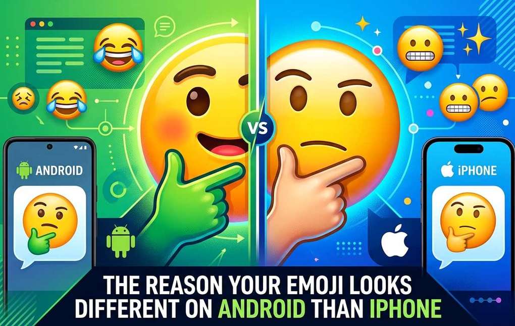
Summary of The Reason Your Emoji Looks Different on Android Than IPhone
- Find out why the same emoji looks completely different on iPhone and Android, and how to send emoticons that look identical on every device.
- This is one of those small, everyday tech mysteries that almost nobody explains properly.
- Before you can understand why emojis look different, you need to understand what an emoji actually is at the technical level.
You send a thumbs-up from your iPhone. Your friend on a Samsung Galaxy receives something that looks off. Maybe a bit rounder. Maybe a different shade of yellow. Maybe weirdly cartoonish compared to what you intended. You both used the same emoji, from the same spot on the keyboard. So why does it look like a completely different image?
This is one of those small, everyday tech mysteries that almost nobody explains properly. And the answer is genuinely fascinating once you see how the system actually works.
Key Takeaways:
- Every emoji has a Unicode code point, a number all devices recognize, but each manufacturer draws its own version of that character
- Apple, Google, Samsung, and Microsoft each maintain entirely separate emoji art libraries
- The same thumbs-up can look noticeably different across iOS and Android skins
- Platform-specific galleries let you preview how emojis actually render on each device before you send
- Text-based emoticons like kaomoji display identically on every phone and OS version, regardless of manufacturer
The Number Behind Every Emoji
Before you can understand why emojis look different, you need to understand what an emoji actually is at the technical level.
When you tap the thumbs-up on your iPhone, your phone does not send a tiny image file across the internet. It sends a number. Specifically, it sends a Unicode code point, a standardized numerical value that represents that character in a global system used by every modern operating system, browser, and app. The thumbs-up emoji is U+1F44D. That string of characters is all that travels when you hit send.
The Unicode Consortium, a nonprofit organization, assigns and maintains these code points. They decide which emojis exist. They write the specification. But here is the critical part: they do not draw the art.
That is where things get interesting.
Who Actually Draws the Emojis You See
What this means for The Reason Your Emoji Looks Different on Android Than IPhone
Once Unicode assigns a code point to a character, every platform is on its own. Apple decides what the thumbs-up looks like on iOS. Google decides what it looks like on Pixel phones. Samsung designs its own version for Galaxy devices. Microsoft does the same for Windows and Teams.
The result is that the same U+1F44D code point triggers completely different images depending on whose software renders it. This is not a bug. It is a deliberate feature of how the standard was designed, giving manufacturers creative control over their visual identity.
The major players have each developed a recognizable style:
- Apple favors glossy, hyper-detailed designs with soft shadows and a slightly three-dimensional appearance
- Google shifted to a flatter, more minimalist style on Pixel phones in recent years
- Samsung has historically used its own distinct art that can look noticeably different from stock Android, even on the same version of the operating system
- Microsoft maintains emoji sets across Windows and Office products that diverge from mobile platforms entirely
This is why a heart-eyes emoji that looks warm and expressive on an iPhone can look stiff or slightly alien when it arrives on a Galaxy. Same code point, wildly different execution.
The Apple Emoji Library: What iPhone Users Are Actually Sending
If you use an iPhone and want to know exactly what your message looks like to other iOS users, or how your expressions differ from what Android contacts receive, the most useful thing you can do is browse a platform-specific reference.Apple emojis give you a complete visual gallery of every character as it actually renders in iOS, from smiley faces to hand gestures to food and travel icons.
This matters more than most people realize. When you pick the "slightly smiling face" to signal something gently sarcastic, you are assuming your recipient sees the same expression you do. A Samsung user might receive a version that reads as completely sincere. The tone of your message can shift based solely on the device on the other end.
The spread of emoji as a global communication standard is directly tied to this fragmentation. As the Unicode standard grew and manufacturers adopted it, each tech company built its own visual ecosystem around it. That creative independence is why the cross-platform rendering gap has never fully closed.
Five Moments Where Emoji Mismatch Actually Matters
It is not just cosmetic. There are real situations where cross-platform rendering causes genuine confusion.
- Tone mismatch in professional messages. A face that reads as gently amused on iOS can appear intensely grinning on Android, changing how a work message lands entirely.
- Romantic ambiguity. The smirking face means different things when it looks flirtatious on one platform and vaguely menacing on another.
- Reactions in mixed group chats. Cross-platform group threads are notorious for this. Someone responds with what feels like a warm smile and everyone else in the chat sees a manic grin.
- New emojis on older operating systems. Send a newly released character to someone on an older OS and they may see a blank square or a generic placeholder box instead.
- Skin tone modifiers. These can render inconsistently across platforms, and in some cases the modifier strips out entirely on older systems, leaving a default yellow that was never intended.
The Platform-Agnostic Alternative That Never Gets Misread
Here is a practical tip that far more people should know: there is a category of text-based emoticons that renders identically on every device, every OS version, every screen size.
They are called kaomoji text faces, and they are built entirely from standard keyboard characters and Unicode punctuation. A kaomoji like (^_^) or (ノ◕ヮ◕)ノ\*:・゚✧ is not an image file. It is a sequence of text characters. Because there is no platform-specific rendering involved, it looks exactly the same whether the reader is on iOS 18, a 2019 Android handset, or a Windows laptop.
For anyone communicating regularly across mixed-device groups, kaomoji are genuinely useful. They let you express emotion and personality without any risk that your thumbs-up will arrive looking sarcastic, earnest, or weirdly robotic depending on what phone your friend uses.
The range of available expressions is broader than most people expect. You can convey everything from confused shrug to pure joy to deadpan exhaustion, all in plain text that every device interprets without any manufacturer interpretation layer in the middle.
How to Check What Your Emojis Look Like on the Other End
Most people have no idea what their messages look like when they arrive. A few habits can close that gap:
- Browse platform-specific emoji galleries before using an unfamiliar character in an important message, especially for anything where tone matters
- Ask a friend on a different device to screenshot what they received, particularly for emojis you use regularly in professional or sensitive contexts
- For high-stakes communication, lean toward text or the most basic emoji characters, like a simple smiley or plain heart, which tend to vary far less dramatically across platforms
The gap between platforms has been narrowing over the past few years. Apple, Google, and Samsung have each nudged their designs toward cleaner, less polarizing styles. But it has not closed entirely, and the differences that remain are enough to genuinely change meaning in context.
Your Thumbs-Up Is Not a Universal Image
The emoji keyboard feels like a shared language. And in one sense it is. Everyone agrees that U+1F44D signals approval. But the visual layer of that shared language is fractured by design, split across manufacturer art teams who each made their own aesthetic choices with no obligation to match anyone else.
That fragmentation is not going away. But knowing it exists changes how you communicate. You can check what your emoji actually looks like to an Android user before you send it. You can lean on text-based emoticons when visual consistency matters more than visual expressiveness. And you can stop wondering why the message you thought was perfectly friendly landed as something a little more ambiguous.
The emoji you sent and the emoji they received were the same idea, drawn by entirely different hands.