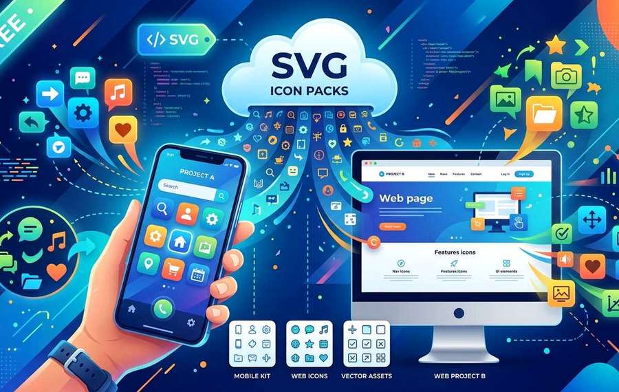
Summary of Free Scalable SVG Icon Packs for Mobile App and Web Projects
- Why SVG beats PNG for mobile UI work and where to find free, ready-to-use icon packs for apps, no design subscription needed.
- If you build mobile apps or skin UI interfaces as a side project, you already know the pain of hunting for icon assets.
- Mobile devices ship with wildly different pixel densities.
If you build mobile apps or skin UI interfaces as a side project, you already know the pain of hunting for icon assets. You need sharp visuals on a 1080p phone and a 4K tablet, and you need them fast, without paying for a Figma plugin subscription or a bloated stock design library. SVG format solves the sharpness problem completely, and there are solid free packs available that make it practical to ship polished UIs without a dedicated designer anywhere near the project.
SVG is the smart default for mobile icon assets in 2025. Here is what that means in practice for indie developers:
- SVG files scale to any screen density without losing crispness, so your icons look identical on a budget Android handset and a 4K Retina display
- The file sizes tend to be smaller than high-resolution PNGs, which matters for app bundle weight and over-the-air update speed
- You can restyle, recolor, and animate SVG assets with plain CSS or JavaScript, with no image editing software required at any point
Why Screen Density Makes PNG Icons a Problem
Mobile devices ship with wildly different pixel densities. A mid-range Android phone might sit at 300 PPI. A flagship folds to a 400 PPI inner display. An iPad Pro pushes past 260 PPI on a much larger canvas.
When you rely on PNG icons, you end up maintaining multiple copies. You need a 1x, a 2x, and often a 3x version for iOS alone. Android's drawable qualifier system adds even more variants. That multiplies your asset management overhead fast, especially if you are a solo developer or a small team shipping updates on a tight schedule.
Scalable Vector Graphics, by contrast, are mathematically described shapes. They have no native pixel dimension. A 24x24 icon specified as an SVG renders at exactly the right sharpness whether the operating system asks for it at 48 pixels or 192 pixels. You maintain one file. The renderer handles the rest.
This is not a minor quality-of-life improvement. For teams managing 50 or more UI icons, consolidating to SVG can cut asset folder size significantly and eliminate entire categories of "blurry icon on device X" bug reports.
What Makes a strong SVG Icon Pack for App Development
Not all SVG packs are created equal. A lot of free icon sets online are technically SVG files but have been exported carelessly, with embedded raster images, unnecessary groups, or inline styles that break when you try to apply a theme color programmatically.
When you are evaluating a pack for real app use, look for these qualities:
- Clean path data with no embedded PNG fallbacks or base64 blobs hiding inside the SVG XML
- Consistent artboard sizing, ideally 24x24 or a uniform grid, so icons align without manual adjustment
- Logical naming conventions that match how you would reference assets in code
- Minimal grouping, which makes it easier to target specific paths for color overrides via CSS currentColor
A pack that checks those boxes saves you a lot of cleanup time before the assets are production-ready.
Social and Navigation Icons: The Core UI Layer
The sharing and navigation layer is often the first thing developers stub in with placeholder icons and then forget to replace before launch. A social sharing row, a navigation bar with home and profile icons, a floating action button, a hamburger menu. These are the elements users interact with constantly, which means rough or inconsistent icons at this layer are noticed immediately.
The social media icons collection is built specifically for this use case. The pack covers the major platforms with consistent stroke weights and unified visual style across the set, which is not something you can always guarantee when you grab icons from four different sources and try to combine them yourself.
For app navigation specifically, stylistic consistency across your icon set matters more than individual icon quality. A beautifully drawn Instagram glyph sitting next to a slightly bolder LinkedIn mark will catch the eye of users even if they cannot articulate why something feels off. Starting from a unified pack removes that inconsistency from the equation before you write a single line of UI code.
Using Icon Sets in React Native and Flutter
Dropping SVG icons into a mobile project is straightforward once you know the tooling.
- In React Native, the `react-native-svg` package lets you import SVG files directly as components. You can pass `fill` as a prop to restyle icons from your theme context without touching the source file.
- In Flutter, the `flutter_svg` package handles rendering with similar simplicity. Point it at your asset path and it handles pixel density automatically.
- For web-based mobile apps or PWAs built with frameworks like Ionic or Capacitor, you can use SVG directly as `img` tags or as inline markup, with CSS custom properties controlling color at a theme level.
- In native Android (Kotlin or Java), convert SVGs to Vector Drawables using Android Studio's built-in import tool, which preserves path fidelity at every screen density.
- In native iOS (Swift or Objective-C), PDF assets in the asset catalog handle density automatically, but SVGs can also be rendered via third-party libraries like SVGKit if you need programmatic recoloring.
Emoji and Reaction Icons for Messaging Features
Messaging features and reaction systems have become standard in mobile apps across categories. Fitness apps let users react to friend workouts. Productivity tools add emoji status indicators. Gaming apps surface reaction overlays during sessions. Even simple utilities now include a feedback or rating layer with face-based icons.
Building this from scratch is surprisingly fiddly. Emoji rendering varies significantly across operating systems, which means a face you design for Android may look noticeably different when a friend opens the same message thread on an iPhone. Using a consistent custom icon set for your reaction layer gives you full control over appearance and avoids the cross-platform inconsistency of system emoji fonts.
The emoji face SVGs pack is worth bookmarking for exactly this scenario. The collection covers the expressive range you need for a basic reaction system, from positive to frustrated, and because they are SVG, you can animate individual paths, adjust scale, or apply color theming to match your app's palette without any rasterization artifacts.
For reference, research from the Unicode Consortium's emoji working group highlights how wildly emoji rendering diverges across vendor implementations, which is the core reason custom SVG faces are often preferable to relying on system emoji in structured UI elements.
Building a Reaction System With Custom SVG Faces
A lightweight reaction implementation with SVG icons typically involves a few moving parts:
- A container component that renders the icon grid or carousel
- A state management layer that tracks which reaction the current user has selected
- A CSS or style transition on scale and opacity for the selection animation
- An API call or local state update that persists the reaction count
Because SVG paths are addressable in the DOM or via framework abstractions, you can animate the selected face independently of the others. Scaling it up on tap, pulsing the fill color, or morphing between two expressions are all achievable with CSS keyframes and no additional dependencies. That kind of micro-interaction significantly improves the perceived responsiveness of a reaction feature without adding measurable overhead to your app.
Keeping Your Asset Pipeline Lean
One habit that pays off over a long project is treating your SVG icon set as a dependency rather than a loosely collected folder of files. A few practices that help:
- Store your icons in a single versioned directory and reference them via a barrel file or a centralized icon component
- Name files by function rather than appearance, so `share-facebook.svg` rather than `blue-f-icon.svg`
- Run an SVG optimizer like SVGO as part of your build pipeline to strip editor metadata and reduce file size before the assets hit production
- Document which icons are in active use and which are legacy, to avoid shipping dead assets in your bundle
This is especially important if multiple developers are touching the same codebase. Without a clear asset management strategy, icon directories tend to accumulate duplicates and forgotten variants that add weight to every build.
The Real Cost of Design Subscriptions for Small Projects
Large studios can justify a premium icon subscription because they spread the cost across many projects and many developers. For indie developers or small bootstrapped teams, those costs stack up fast alongside other infrastructure expenses.
The appeal of free SVG packs is not just price. It is the ability to evaluate, integrate, and ship without procurement delays or license audits. MIT-licensed or CC0 assets mean you can use them in commercial apps without legal complexity. That matters when you are moving fast and do not have a legal team reviewing every asset source.
Where Sharp Icons Sit in the Bigger Mobile Craft Picture
Icon quality is one of those things that does not make a bad app strong, but it reliably makes a competent app feel more finished. Users rarely articulate "the icons are sharp and consistent," but they notice when they are not. A blurry share button at 3x density, or a reaction face that looks slightly off-model from the others, erodes confidence in the product in ways that are hard to diagnose from reviews alone.
The shift to SVG is genuinely low-effort for most modern stacks, and free, well-made packs have removed the last real barrier. The only thing left is to swap out the placeholder PNGs, pick a consistent set, and ship something that looks deliberate at every pixel density your users carry in their pockets.